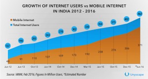
Not long ago, mobile changed the way we used to communicate. Now mobile internet is changing the way we look at things. We all are well aware of the expanding mobile users and so is the mobile internet consumption. To speak statistically, India’s mobile internet user base will touch 730.7 million by 2018.
If you still aren’t convinced with the above graph, enlisted here are some reasons why you should FOCUS on your mobile site now?:
- Since 2014, mobile overtook desktop as the primary device people use to access the internet, which means desktop should no longer be the only thought web designers and marketers have when developing a website. Coincidentally, the number of smartphones has surpassed the number of personal computers.
- Around 30% of traffic coming from mobile devices (and some sectors seeing an even higher proportion of mobile traffic).
- If not you, your competitors are probably already there at the click of a button.
Google’s update back in 2015 punished any website that lacked mobile-friendly pages by decreasing the site’s ranking in mobile search results. - Google’s new algorithm encourages businesses to think about mobile first.
Worried a bit, We got you covered.
Developing websites that are mobile-friendly is more than just cross-browser; it’s about cross-platform. As one of the fastest growing platforms, mobile marketing has become a MUST HAVE for companies looking to grow. But how would you differentiate it with a desktop version.
Your mobile site should not really have:
- Text too small
- Links that are teeny-tiny
- Users need to scroll way too much to read
- Select buttons suffer non-functionality
- Too much of ads and redirects
All these are signs of non-optimized mobile site. And BEST solution to check whether a site is mobile- friendly or not, Google-bot labels the site. And here’s how it labels it:
- A site that avoids software that is not common on mobile devices such as flash plugins
- Site that is readable without zooming
- The site that sizes content aptly to the screen so users don’t have to scroll horizontally or zoom
- A site that places links far enough apart so that the correct one can be easily tapped on.
Now, if you want there are some tests and guides to help you figure out your site’s ‘mobile- friendliness’. Read on:
- Check site pages with Mobile Friendly Test.
- Mobile Usability Report in Google Webmaster Tools highlights your usability issues across the site, not just for one page.
- Improve your shortcomings in the mobile site as per Webmasters Mobile Guide.
- You can also refer to Guide for Third Party Softwares like WordPress and Joomla; in order to migrate your site hosted on a Content Management System (CMS) while using a mobile friendly site template.
In addition to this, the above documentation and tools are available in English as well as other regional language for a CONTROLLED & SMOOTH transition to a mobile site.
So, go ahead try them out. These labels are the first step in helping mobile users to have a BETTER mobile web experience raising your digital presence and Google ranking hand-in-hand.

